Advendis. An identity designed for independence.
Summary
Care Forward Noord became independent and lost its name. In 27 days it got a new name, a brand identity, illustrations, motion and a website, all from one hand. On the day of the split, Advendis was complete, with a system the team of 43 can keep using on their own.
A trusted care organisation had to become independent without losing what made people trust it in the first place.
How do you start over without starting from scratch?
An important part of that care is for people with a migration background. For them, language, culture, family dynamics and past experiences often help decide which support actually works. That is why Advendis doesn’t start from a standard approach, but from understanding the person, their background and the world around them.
The team is made up of professionals and experts by experience from different cultural backgrounds, speaking different languages. That lets Advendis connect better with clients and close the distance between people and institutions. The care becomes not only more accessible and more personal, but also more effective.
For years the organisation operated as Care Forward Noord, the northern half of Care Forward, alongside an office in Breda. When both offices decided to go their own way, the name Care Forward stayed in the south.
For Groningen, that meant a new beginning, but not from zero. The people stayed, the expertise stayed, and so did the trust built up over the years before.
Only the name was gone.
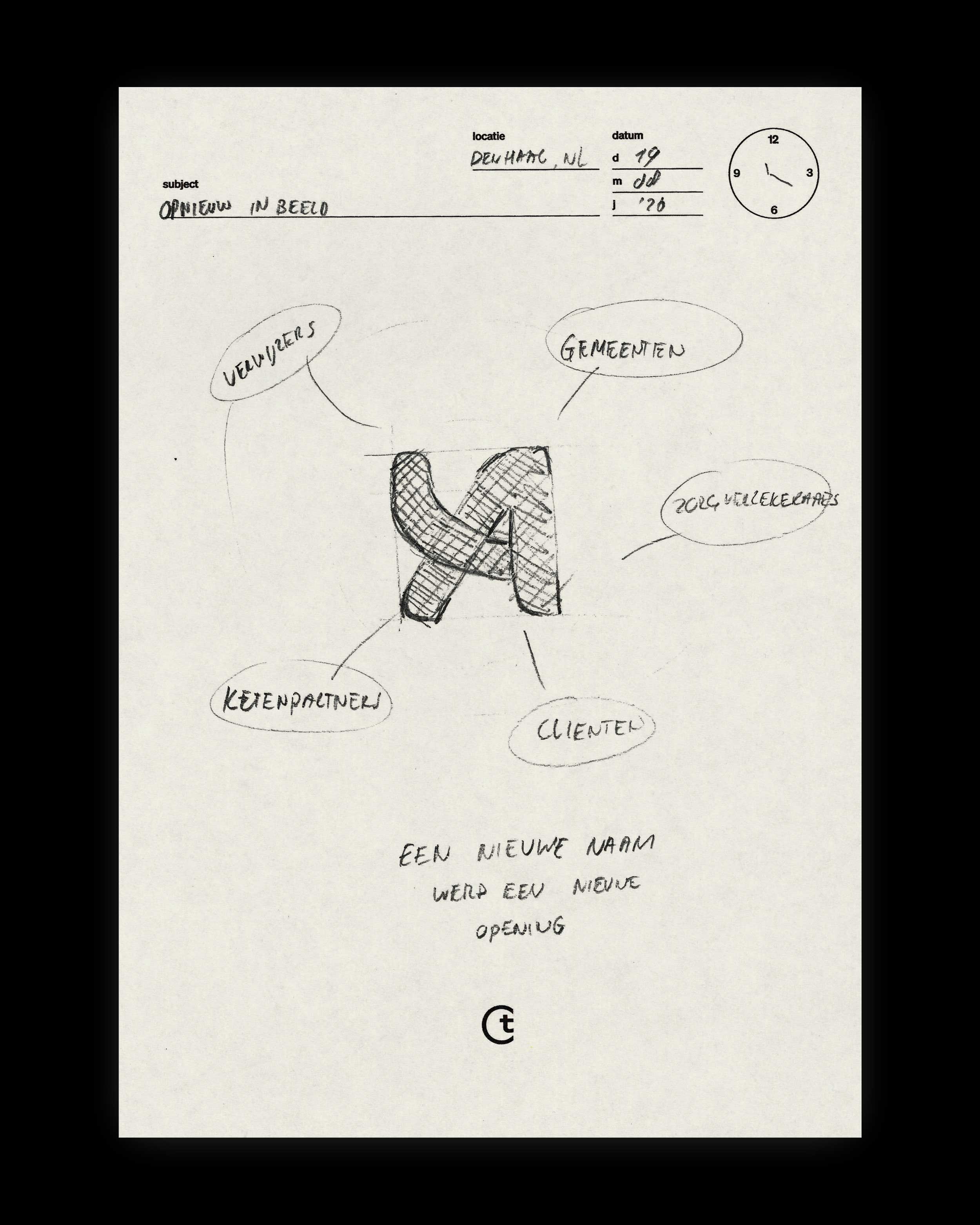
Suddenly there was a blank sheet on the table. We were asked to develop a new name and identity for it that wouldn’t feel like a break with the past, but like the logical next step.


We translated years of expertise and trust into a new name, identity, website and working system. That gave Advendis everything it needed to carry on independently.
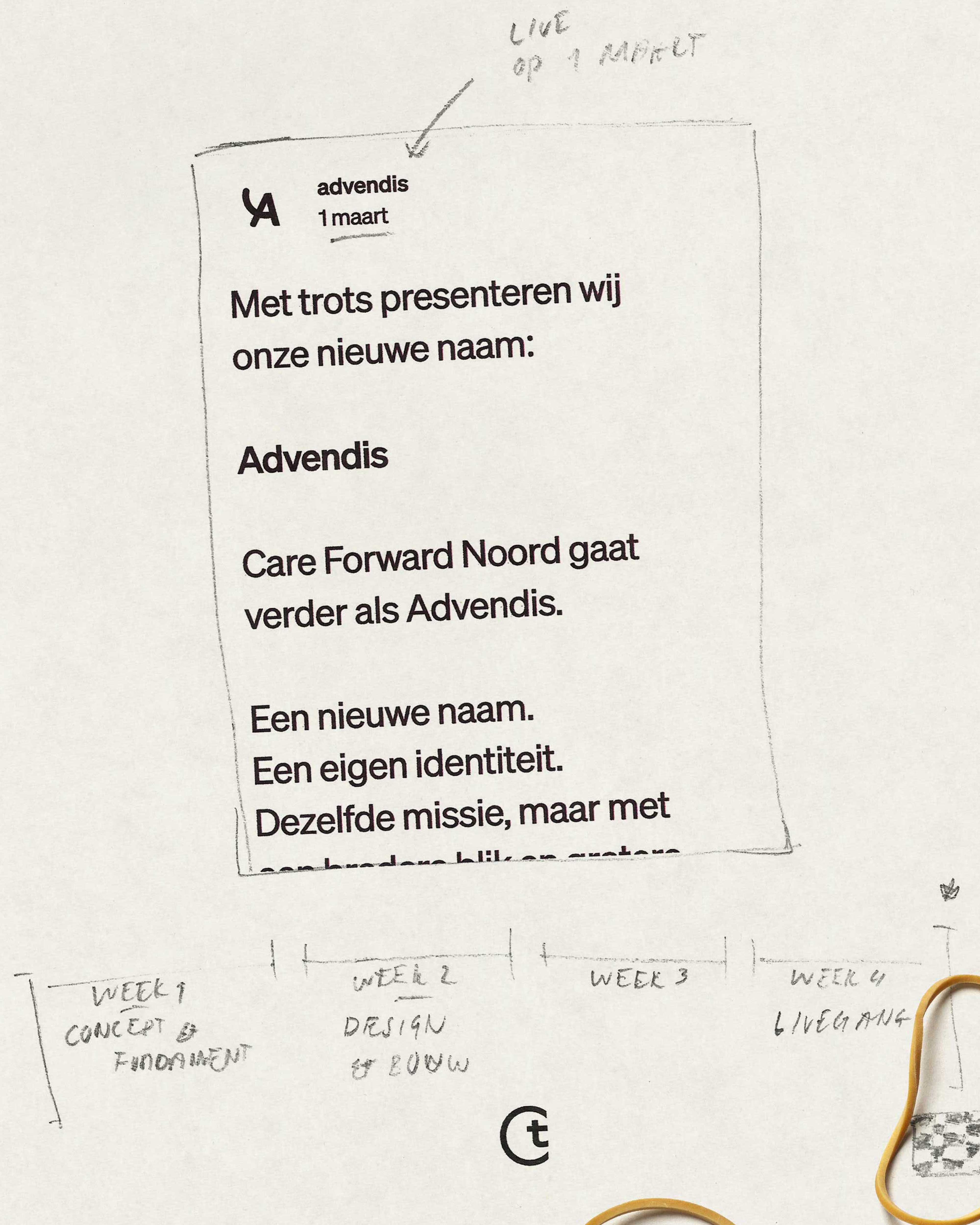
Twenty-seven days 'til launch.
Then, in February, the phone rang.
The organisation in Groningen would carry on independently and had less than a month to become something of its own. Not just on paper, but everywhere clients, staff, municipalities and care partners came into contact with it.
There had to be a new name. A new brand mark. The existing identity had to be rebuilt and brought together. The website had to be written, designed and built. Forms, presentations, email signatures, internal communication and launch materials all had to follow.
There was no soft transition in which the old name could carry what had been built for a little longer. On the day the split became official, a complete and credible organisation had to be standing. No in-between phase. No work in progress.
Every decision had consequences for the next. The name shaped the brand mark. The brand mark had to strengthen the wider identity. That identity then had to work on the website, in print and in the team’s everyday materials.
At the same time, the website had to stay clear for people looking for support, often at a moment when life was complicated enough already.
In 27 days we turned the existing foundation into a complete new organisation, ready to be recognised, understood and trusted from day one.


Care that fits who you are.

The shape shows you the way.
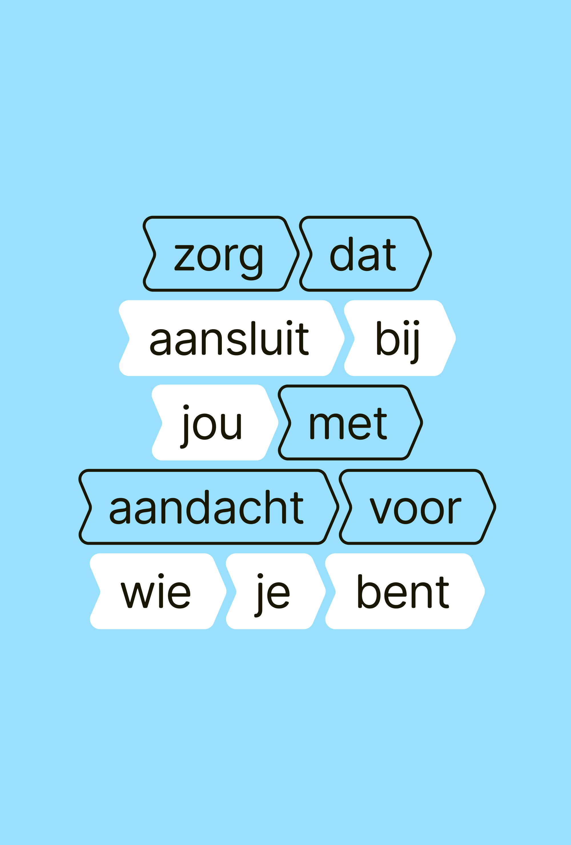
The same idea, everywhere.
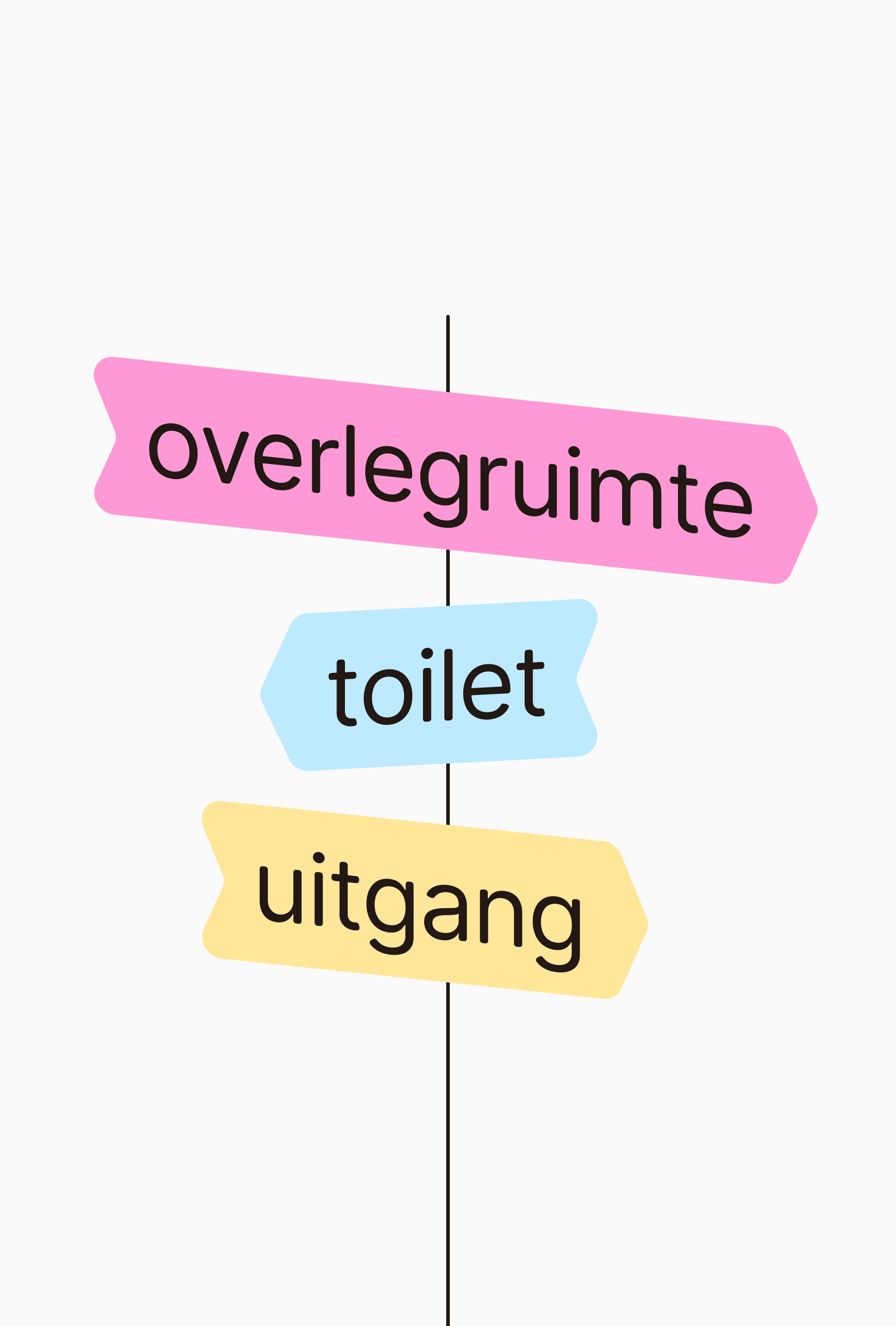
Human. Accessible. Guiding.
Advendis had to become recognisable without losing the warmth people came for in the first place. We built the identity around that warmth, not over it.
A shape that doesn’t just stand out, but helps
So the central shape didn’t become decoration, but a practical part of the system. It frames information, points the way, connects parts and sets a rhythm. On a form it brings structure. In a presentation it makes clear where to look. On the website it guides people through the content.
That matters, because Advendis communicates every day about subjects that can quickly get complex. The identity had to make that information more accessible without dumbing it down, and more human without losing professionalism.
The result is a visual identity with behaviour. A system that works just as well on a small label as on signage, a digital form, a campaign visual or a presentation to a municipality.
The shape stays recognisable precisely because it doesn’t just show who Advendis is, it does something useful every time.


Good care starts with understanding the person in front of you. Their background, language, values and view of the world decide which support fits.
No standard approach for people who aren’t standard
That matters most for clients with a migration background. A request for help rarely stands on its own. Language can affect what someone dares to say. Family can play a big part in decisions. And past experiences with institutions can decide how much someone trusts the help on offer.
That is why Advendis works with a diverse team of professionals and experts by experience who speak several languages and understand different cultural contexts. Not to put people in boxes, but to see better what lies behind a request for help.
That approach closes the distance between client and care worker, and between people and the institutions they deal with. Information becomes easier to understand, support fits better, and the chance grows that someone can actually move forward with it.
The brand had to carry that same thought. Not clinical or distant, but clear, human and open enough for very different people to recognise themselves in it.
Care that doesn’t ask how someone fits the system, but how the system can fit that person better.
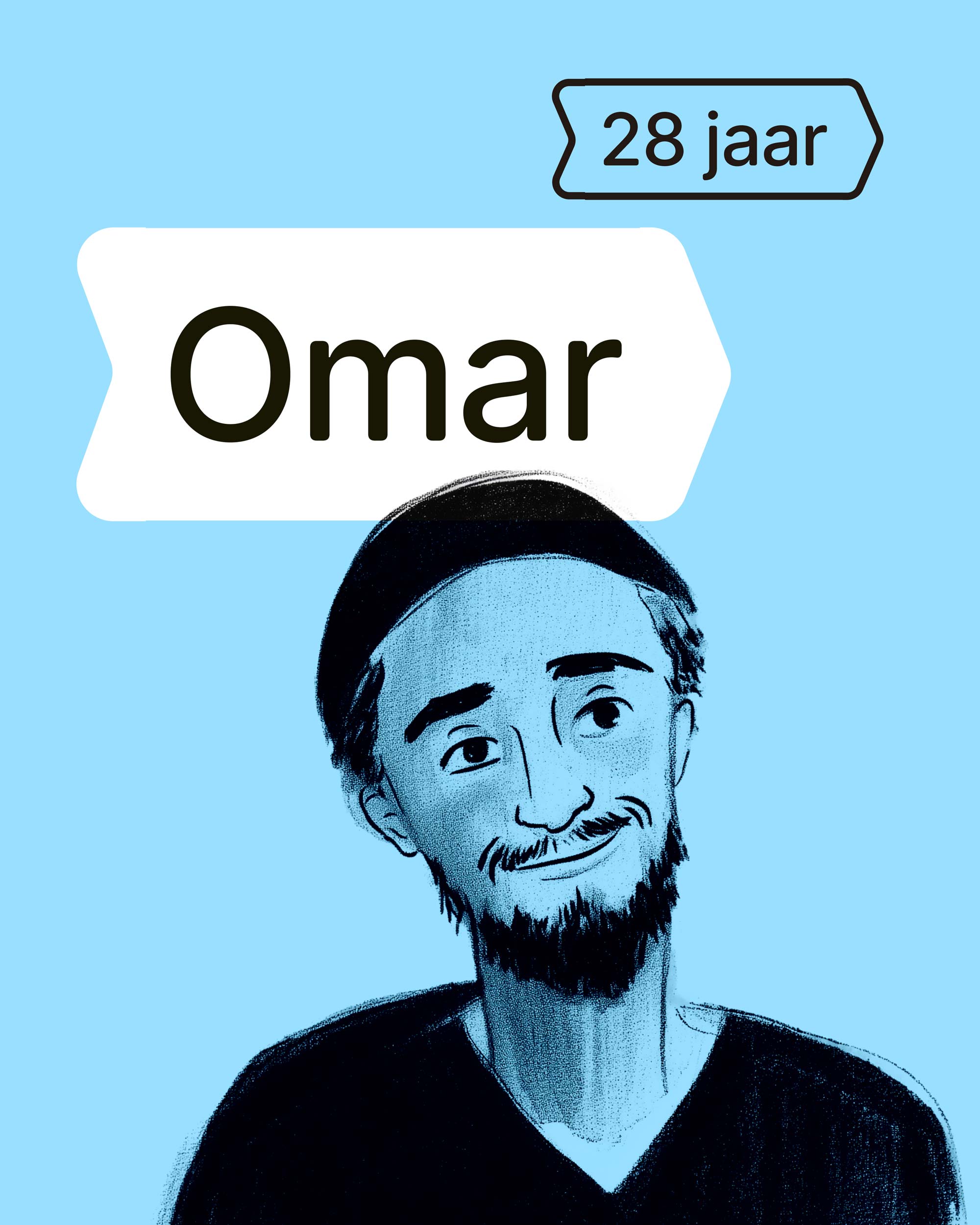
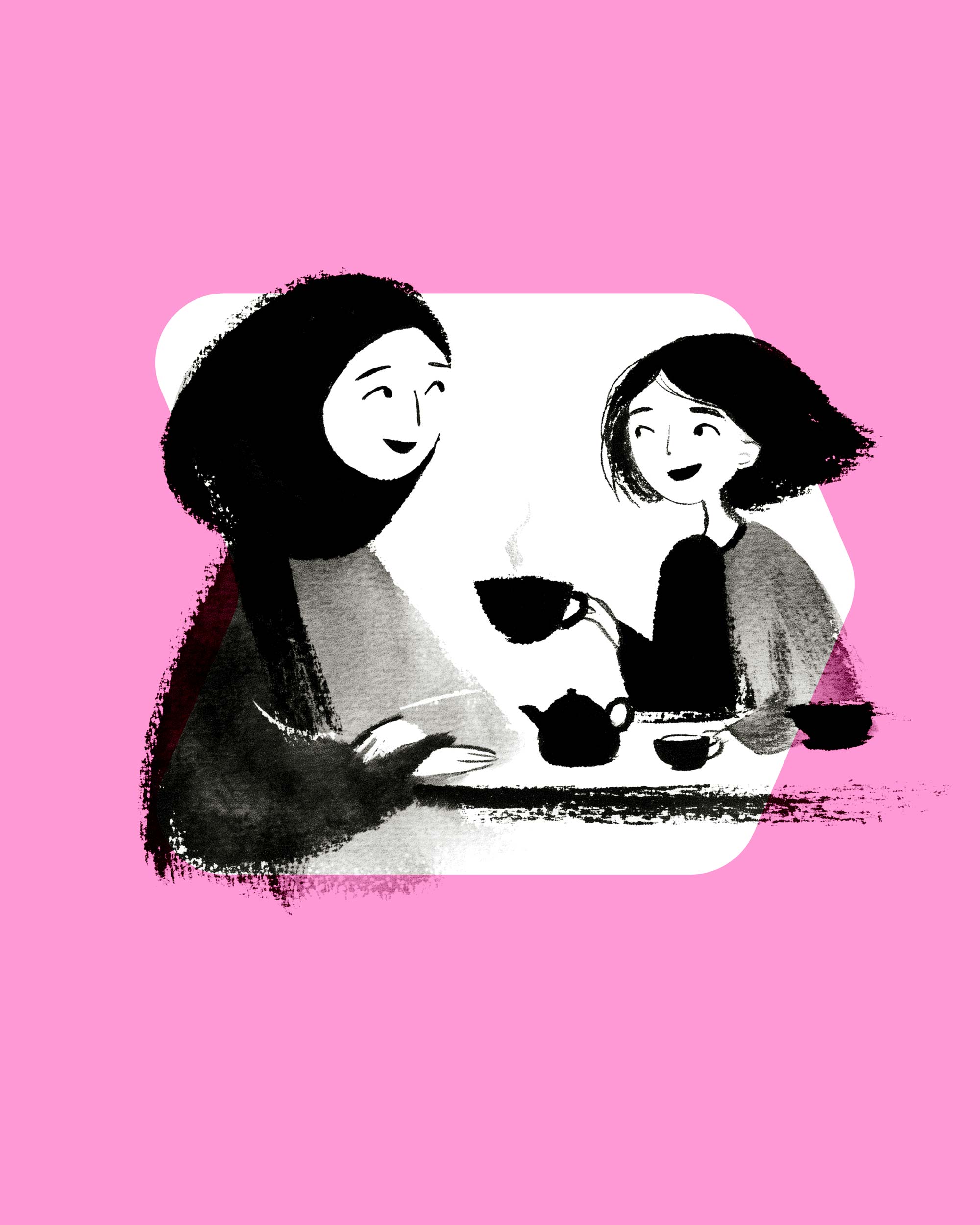
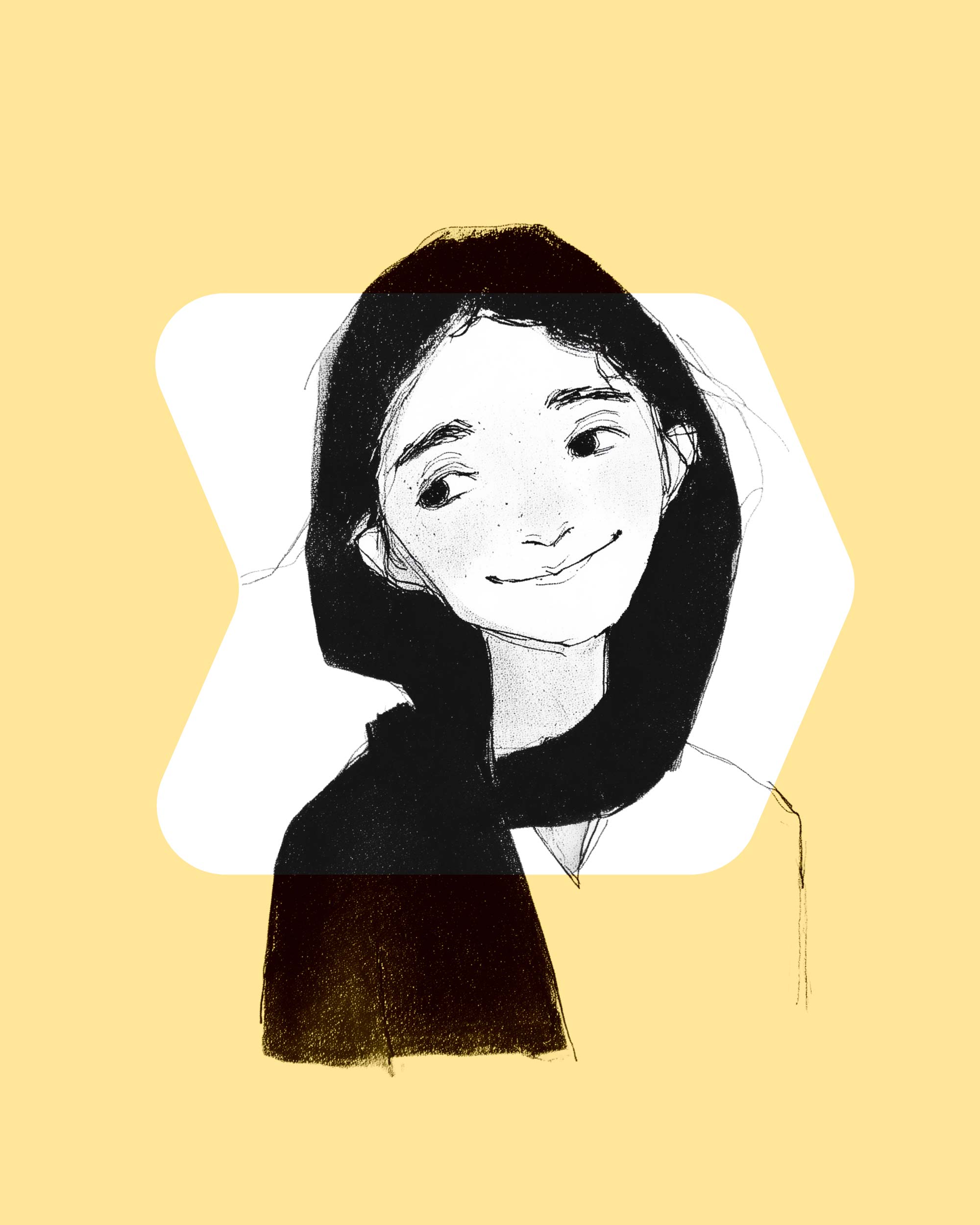
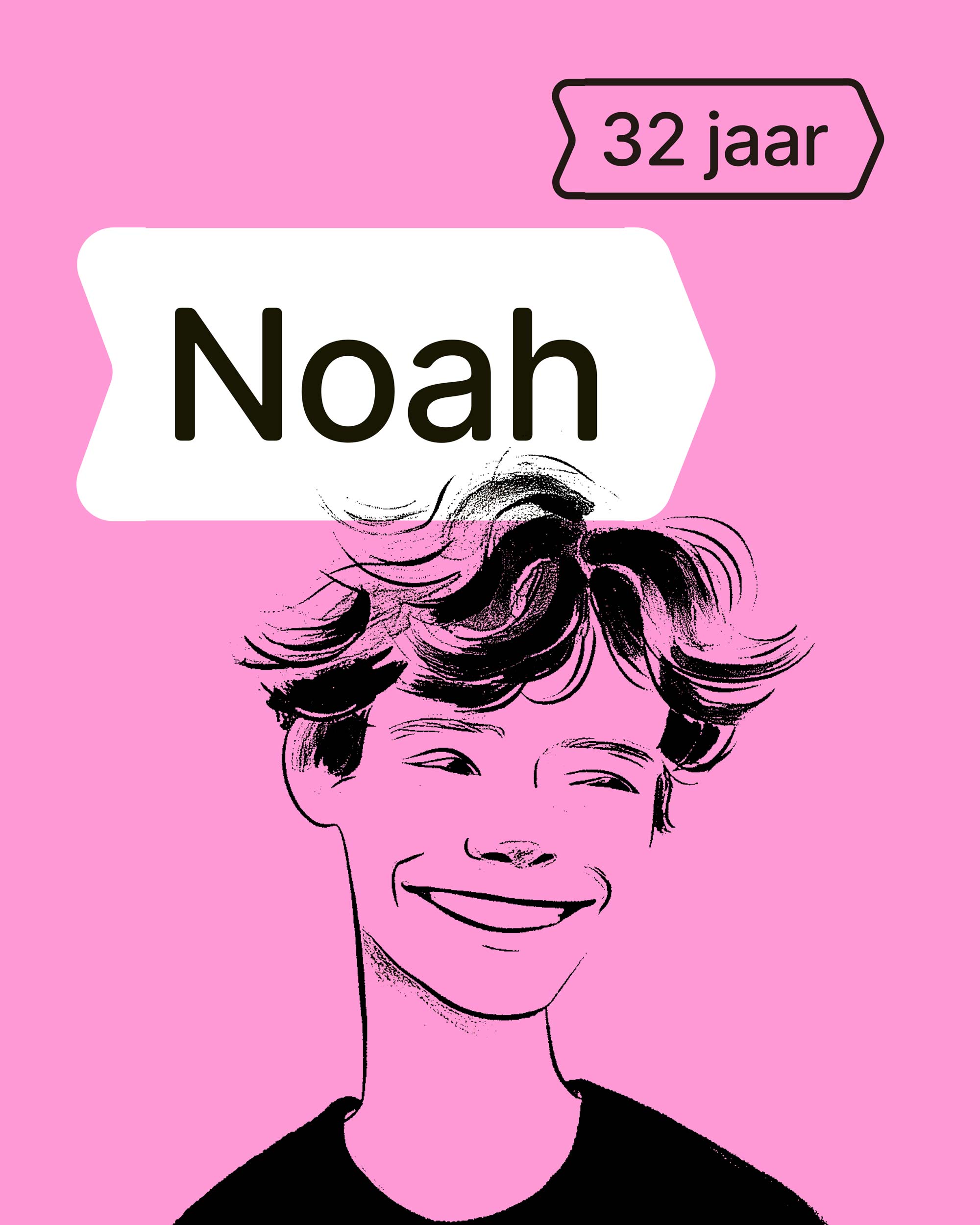
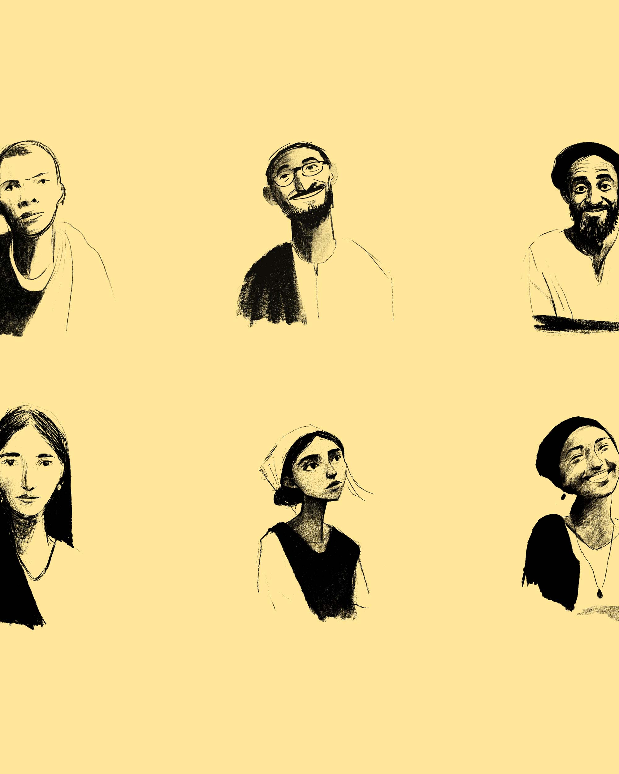
Easier to understand. Easier to trust.
Everyone had to grasp quickly what Advendis stands for
For those professional audiences, clarity is what counts. What care does Advendis offer? Who is it for? What expertise is in house? How do they work? And how does a registration, referral or collaboration go?
So we brought structure to the offer, made key information faster to find and wrote the content so someone can make a sound judgement without needless searching.
At the same time, the website had to stay accessible and human for clients. Care information can quickly turn technical or distant, while what someone needs is clarity about what is possible and what the next step will be.
So we combined precision in content with plain language and a calm, human look. Professional enough for municipalities, insurers and referrers. Clear enough for the people the care is ultimately about.
So professionals can judge faster: this fits. And clients can feel faster: this is a place for me.


Advendis launched on time, with a name, system and story that made independence feel like progress instead of disruption.
In the words of Özkan Unlu, director of Advendis.

Result
A clear place in the market
Advendis now clearly stands for culturally sensitive care that connects with clients’ own world. That makes the organisation easier to understand, harder to compare, and gives the team a clear basis for decisions and communication.
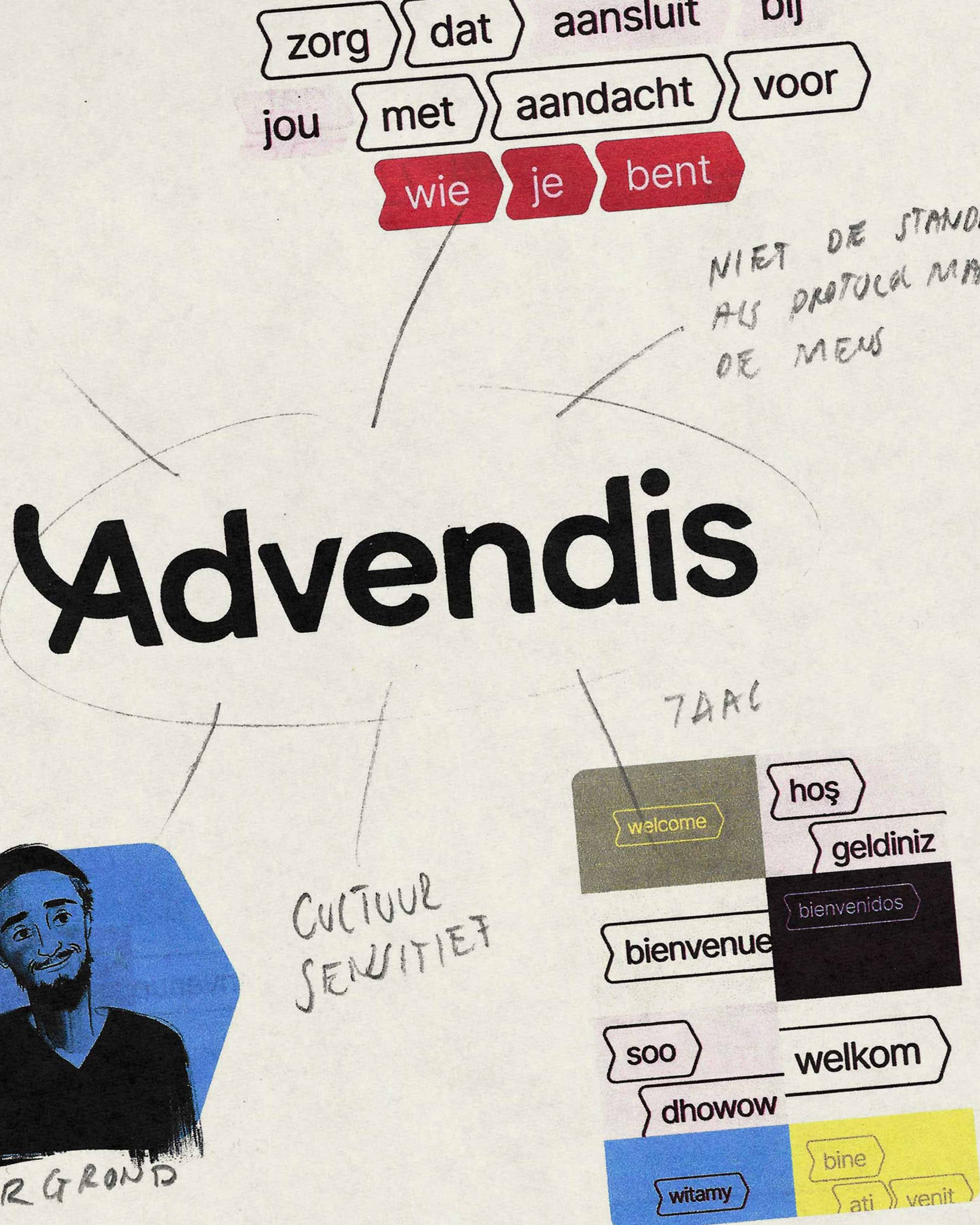
Back on referrers’ radar
The launch gave Advendis a natural reason to reconnect with partners, say clearly who they are and get back on the radar of referrers.
Ready on day one
Within 27 days everything was ready to go out into the world as an independent organisation: a new name, identity, website and the key communication materials.
Easier to remember and to find
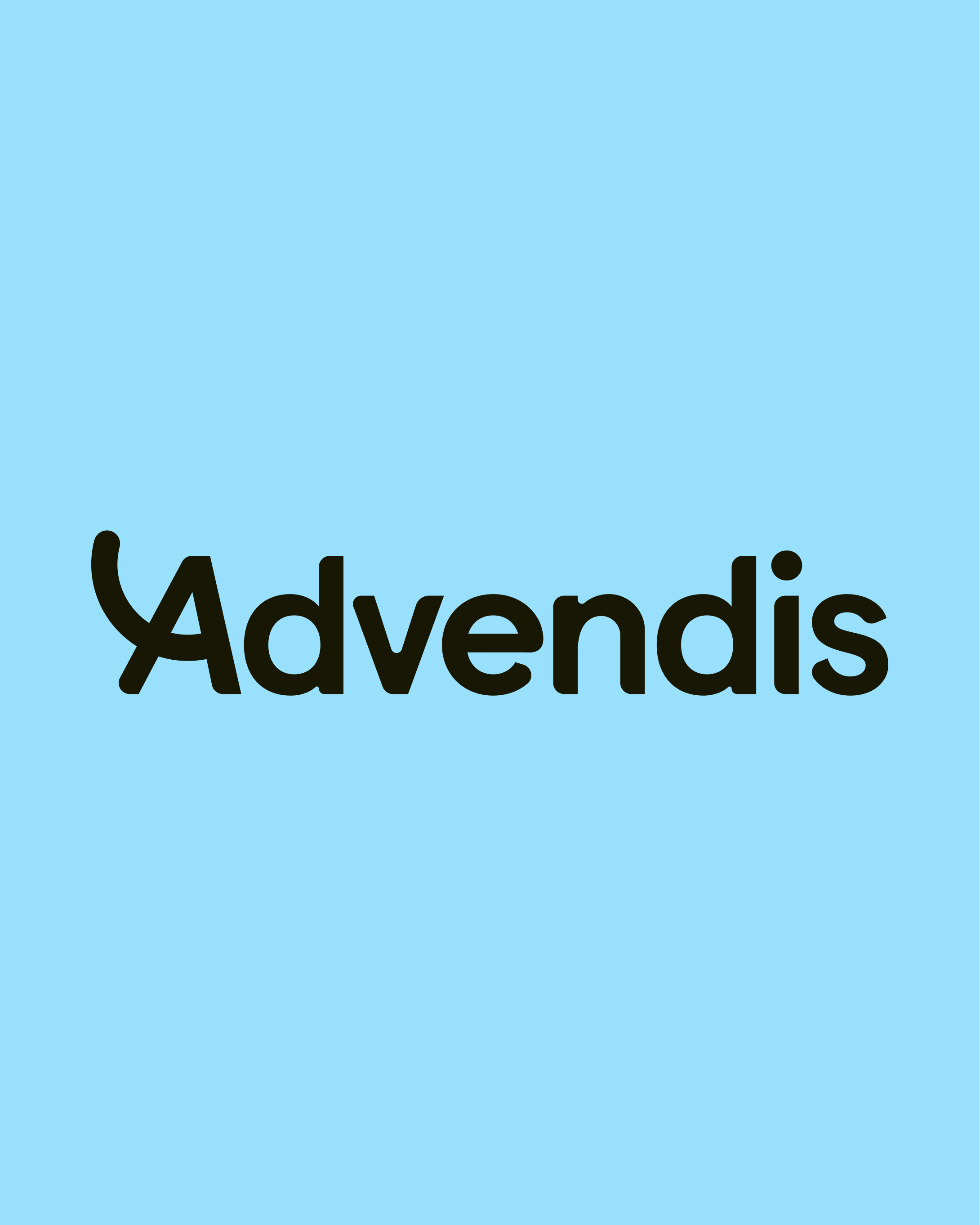
Advendis sounds the way you write it, which makes it easy to remember, pronounce and find again. On top of that, the clear website and simple registration form lower the threshold to take action.
Carried by the whole organisation
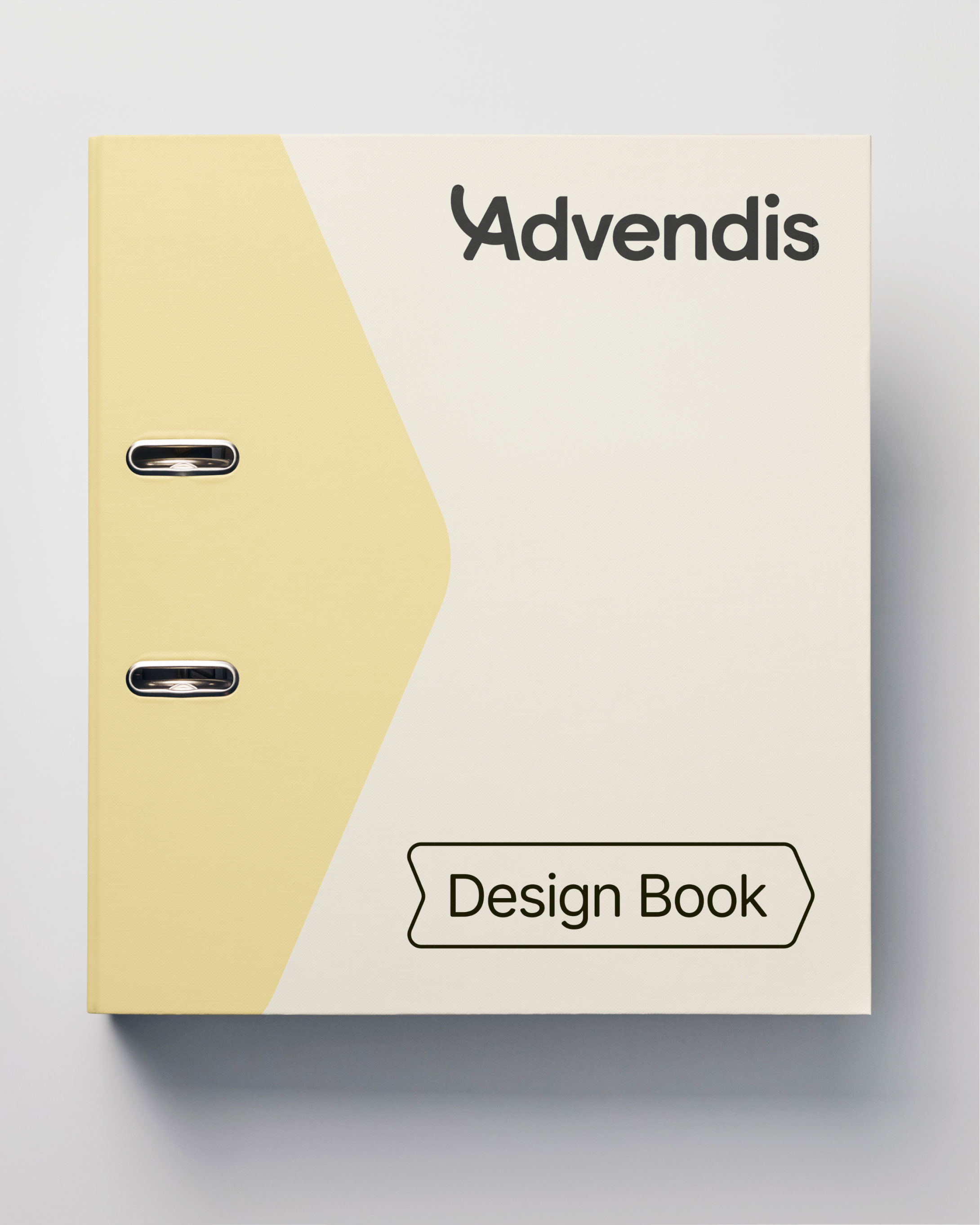
The team of 43 recognised themselves in the new direction and got one coherent system to present Advendis professionally and consistently.
Credits
- Challenge
- Brand split
- Role
- Brand strategy, naming, advice, visual identity, motion
- At Advendis
- Özkan Ünlü, Laura Hollander, Ozge Gorgulu, Remziye Kanbur